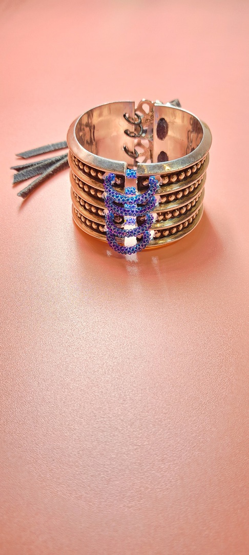
Ravensline 12.23 -1.33
A 10 year exploration of glass beads on metal. An incredibly versatile palette, which holds a vast range of possibilities. Sure to be an exciting delve into a whole new conceptual series. I am looking forward to it.
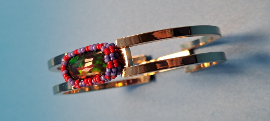
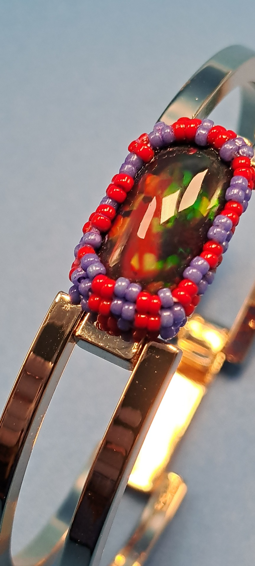
Black Opal Cuff
A firey Welo opal set in a woven cabachon in purple and red Miyuki seed beads, on a gold plated cuff, that has a swinging lock latch clasp.
I wanted a bold weave to surround the dazzle of this recatangular stone, finding purple and red in a striped pattern to give off just such the intensity I was looking for.
Simple, stright-forward and delicate.
I like the open, thin lines of the cuff alongside the larger center stone- making a striking balance between fire, glass, and metal.
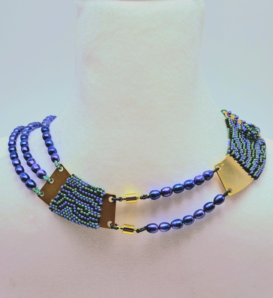
2.24
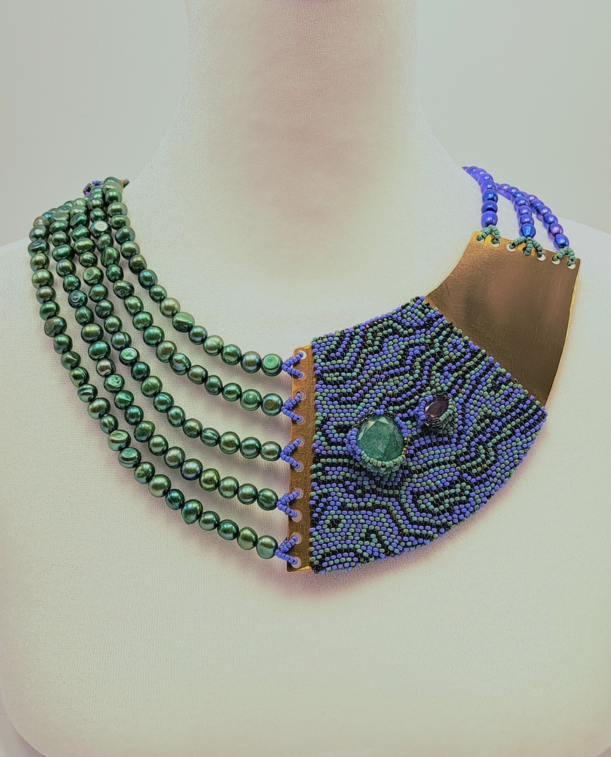
Emerald and Alexandrite Collar with freshwater pearls.
An asymmetrical design using Miyuki seed beads, brass, freshwater pearl beads in seafoam green & purple. Two goldtone barrel screw clasps make a secure hold, while the magnetic centers make for easy no-sight clasping.
This was a challenge to create- mixing larger areas of metal with beads forced the design to be created three dimensionally on a model, in order to estimate the correct draping.
While the metal stays rigid and unmoving, the beads have a natural flow making the balance an interesting unmatched result. The seafoam green beads makes a nice compliment to the golden tones found in the brass metal, while the intense purple pearls add a layered richness.
I could have created a design that had more visual balance (in order for the work to hang on the neck more evenly), but decided that there was something exciting about a design that purposely had no rigidity in expression, and discovered a way to rescind the observers expectations.
The result made a continual design with no repeating values edge-to-edge, creating a collar that can be worn in any direction the wearer so chooses; there is no 'wrong way' to wear it!
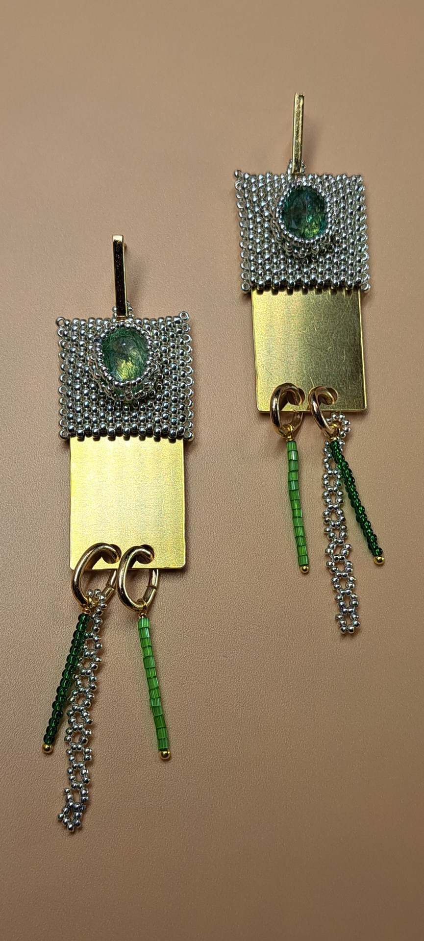
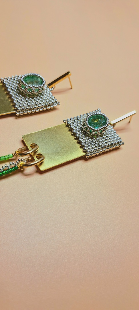
February 2.24
Emerald and brass earrings made with silver seed beads, vintage satin beads, and green glass seed beads- On gold-plated surgical drop posts.
A set of emerald earrings that mimic one another in every way except one; in saturation. With a slight variance between the stones, this earring set enchances the two-tone green bead sway, while remaining happily balanced in the constancy found in the rest of the design.
I was happy with this first attempt at duplicate creation, and decided to use both larger and smaller silver seed beads in combination, to give a subtle variance to the beadwork; allowing the cabachon to hold better detailing around its edges with smaller beads, and then balance that intricacy with a larger weave surrounding (which helps the work avoid a visual competition between cabochon and stitchery).
I try to create work that is comfortable, work that has a practical advantage for longer display, and I was pleased to see that this set kept that classic endurance of a post, while retaining a formal style for exceptional wear time without excessive weightiness.
I am looking forward to recreating this design in silver and gold for further exporation.
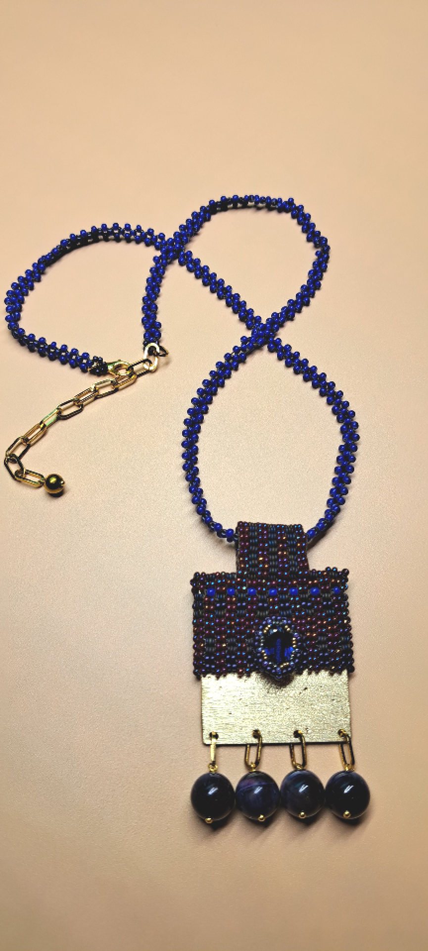
1.24
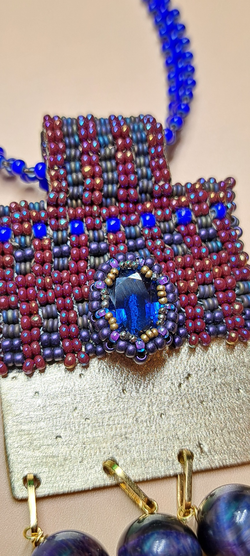
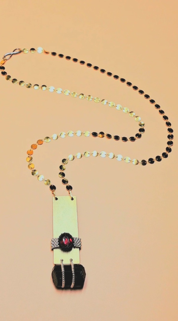
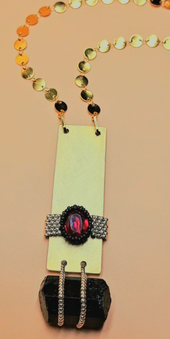
A sapphire stone set with sueded matte purple, AB brick red seed beads, and purple tigers eye with brass accent, and a blue heart beaded chain. 2.5 " x 3.0" size pendant.
The second creation in December's cabochon exploration.
While I could have gotten much larger with this second attempt, I wanted to keep the work practical in wear, and not overzealous in appearance; keeping the pendant on a smaller size with chill, earthy colors.
The blue heart beads add a nice support to the main stone, being slightly colder and bolder- they make a clear distinction as to not compete with the beautiful blue shade found in the sapphire. I intended to use an abstracted woven design, but found that a uniform, formatted weave had an interesting value to the overall design that worked better.
I initially considered a collar style length necklace, but found the idea somewhat boring and predictable. Instead (wanting to do something unexpected), I used a thinner,
longer cording with a larger, oversized woven bail that mimicks the sqaure shape of the pendant.
This gave a nice balance to the design while also keeping the eye focused on the beadwork rather than metal element.
These first two ideas have been using textiles on brushed metal, and I have enjoyed how glossy beads on a matte metal work together. In the second, I played with the idea of a starry sky making deeper dots into the brass- with the blue stone reminding me of the night.
My next attempt will be quite the opposite, and will work with polished brass on a shorter neckline, with a much louder statement. While still feeling compelled to do some of the aysmmetrical weave styles, I'm ready for a different approach entirely, and might want to consider a cuff along the way.
12.23 Starting with a modest pendant for Decembers cabochon exploration:
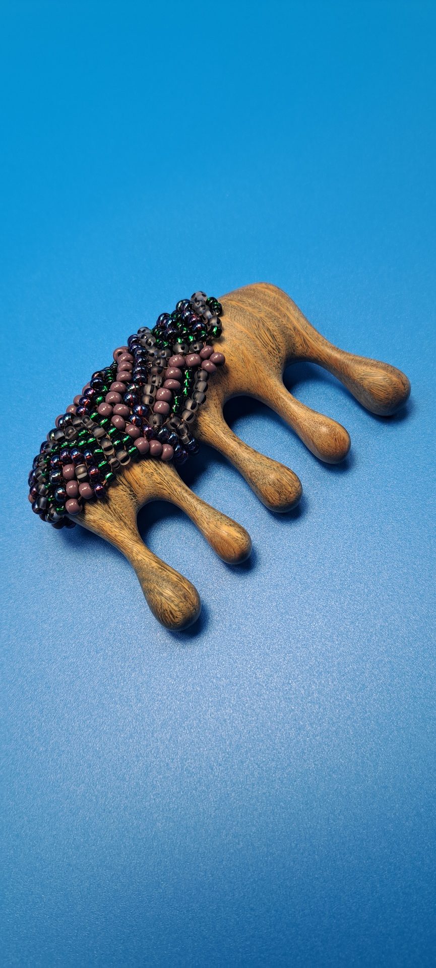
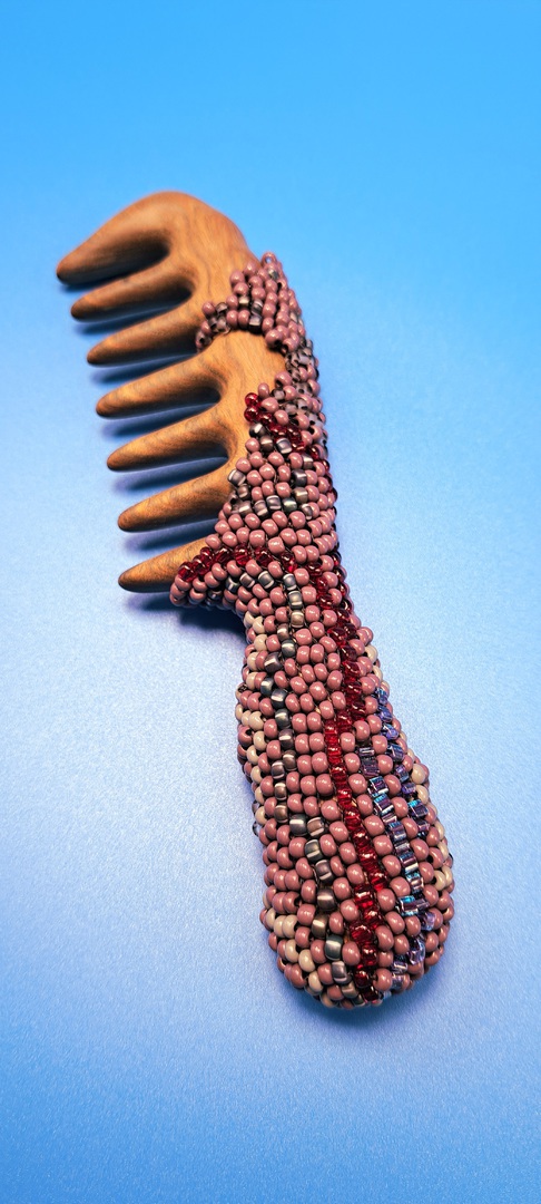
'Organics' Comb Series 3.24
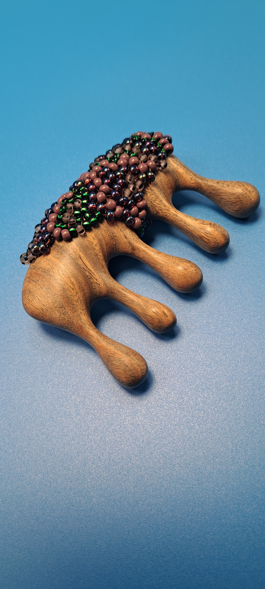
Comb #2: 'Small Comb'
Seed beads woven in a free-form peyote stitch pattern, on a carved teakwood comb in eathy colors of green, brown matte stripe, and purple seed beads.
I really enjoy how this design seems to creep around the comb wherever it might want to, feeling very much like fungus on rocks, or perhaps sap dripping from a tree.
The beads have a cool-to-the-touch feel, while the raised surface protects the wood underneath from nicks and cracks.
Threaded with brown Nymo string.
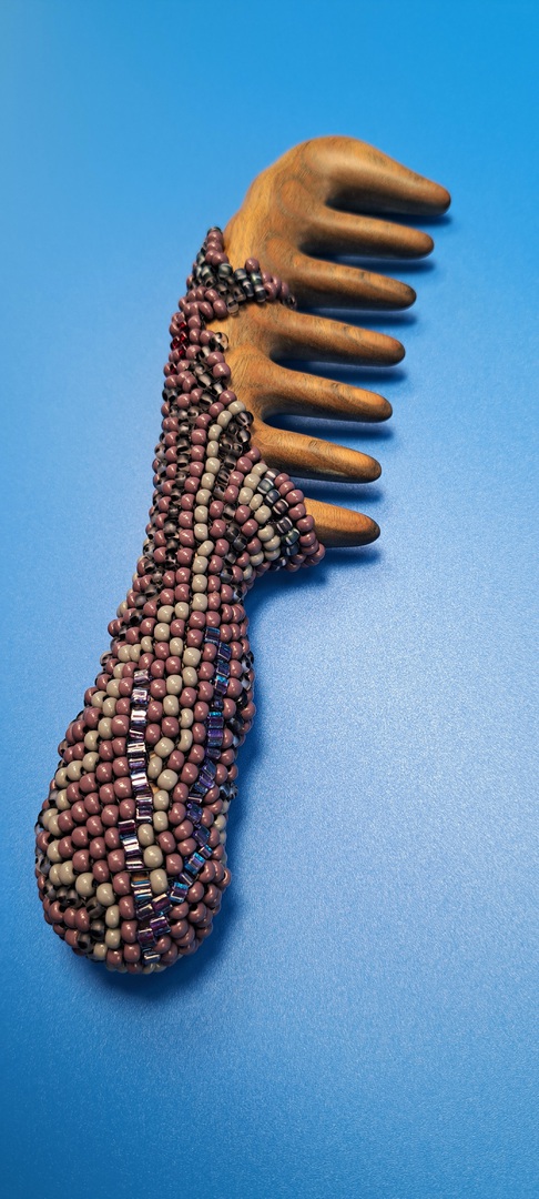
Comb 1: 'Handheld Comb'
A heavy handled, large-toothed comb in earthy colors with a sharp red vein of beads contrasting, reminds us of lifes blood force, and of our primal drives- which in this case, is symbolic of its very function: A comb that untangles our hairy details, and eventually organizes us (hopefully, without too many snags along the way).
This teak wood comb has a simple, yet gentle pull, while its heavier handle makes downward brushing less forceful on the wrist.
The glass beads are cool to the touch, while the larger seed beads (woven in peyote stitchery) makes for a solid grip, with superior colorstay in the handles design.
An asymmetrical, flowy weave pattern in long swirly lines of purple, grey, calico blue, and clear red beads mimic the natural growth found along the forest floor, while the smooth curvature of the carved wood balances nicely against the open weave design- giving a feeling of moss growing on a wood, or water on sand.
I felt inspired to work with these combs primarily due to their unique, exaggerated features- and while I had initally drawn up a completely different design for this series entirely, I set it aside as I noticed that the wood itself held a beauty to it, and decided to highlight it instead.
I am excited with this series because it is very free-form in design,- very loosy goosy, and allows for many last minute decisions which doesn't always happen when planning out designs in beads. I enjoy the way the beads feel in hand, when I grip the handle- especially in a larger size seed bead as we see here (in a size 8).
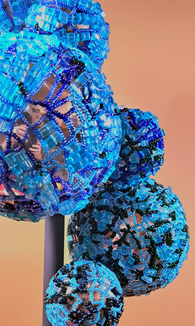
MolecularLi 11.23
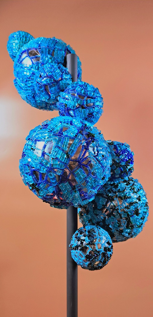
MolecularLi #2 in a series of 4:
Similar to MolecularLi #1 in design, yet a completely different approach in terms of stitching and beads- #2 is a clear progession in the series.
This design slowly incorporates larger aqua beads as the spheres spin upwards. I thought that the constrast of a square bead on a spherical shape might create something different, and a formatted line ( rather than round beads which would mimic the roundness of the spheres), would give an irritating contrast to the roundness.
It was both a challenge and an experiment as I often don't mix larger beads with seed beads (the work can look messy), but found an interesting harmony of the two with this creation.
You can see with the lower spheres, one type of beadwork with the lighter blue, but as they continue upwards, there are darker colors, and the larger beads start to dominate.
I was hoping to give a transformative quality to this piece- having it feel like one particular pattern at one end, and a completely different set of values at the other. I wanted to see how the two might graduate into one another- to give a sense of motion, change, and having the surface just more visually engaging to look at over and over again.
I am happy with what I discovered in this work, and am hoping MolecularLi #3 will produce something more refined, more intentional- with perhaps some additional ideas to really empower the MolecurLi concept.
I like the finish of #1, but regretted not incorporating some of the silver underneath, yet in #2 am desiring more of the solid work find in #1.
In #3 we will see if we can't find a way to include both..this should be interesting :-)
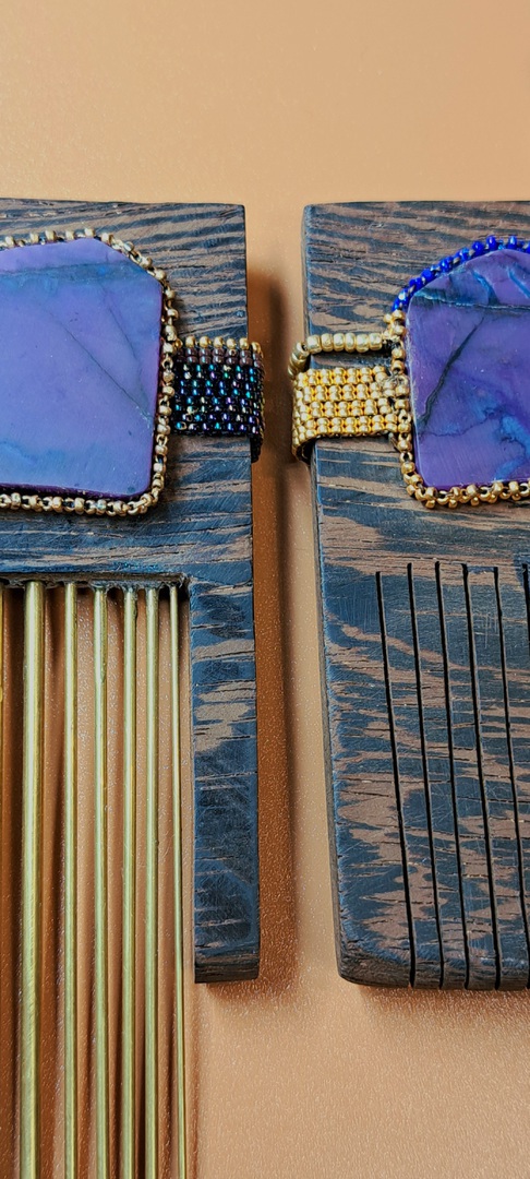
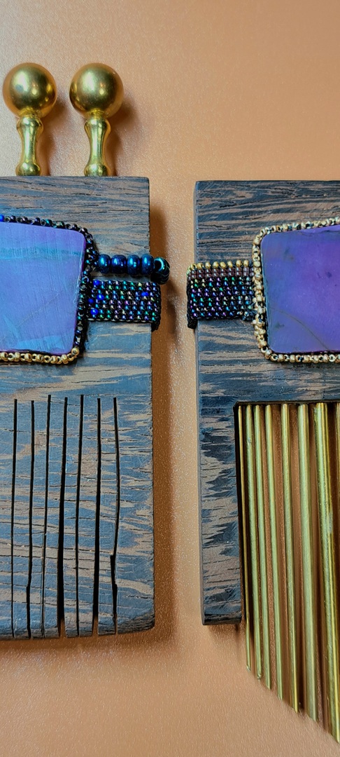
Twin Combs 10.23
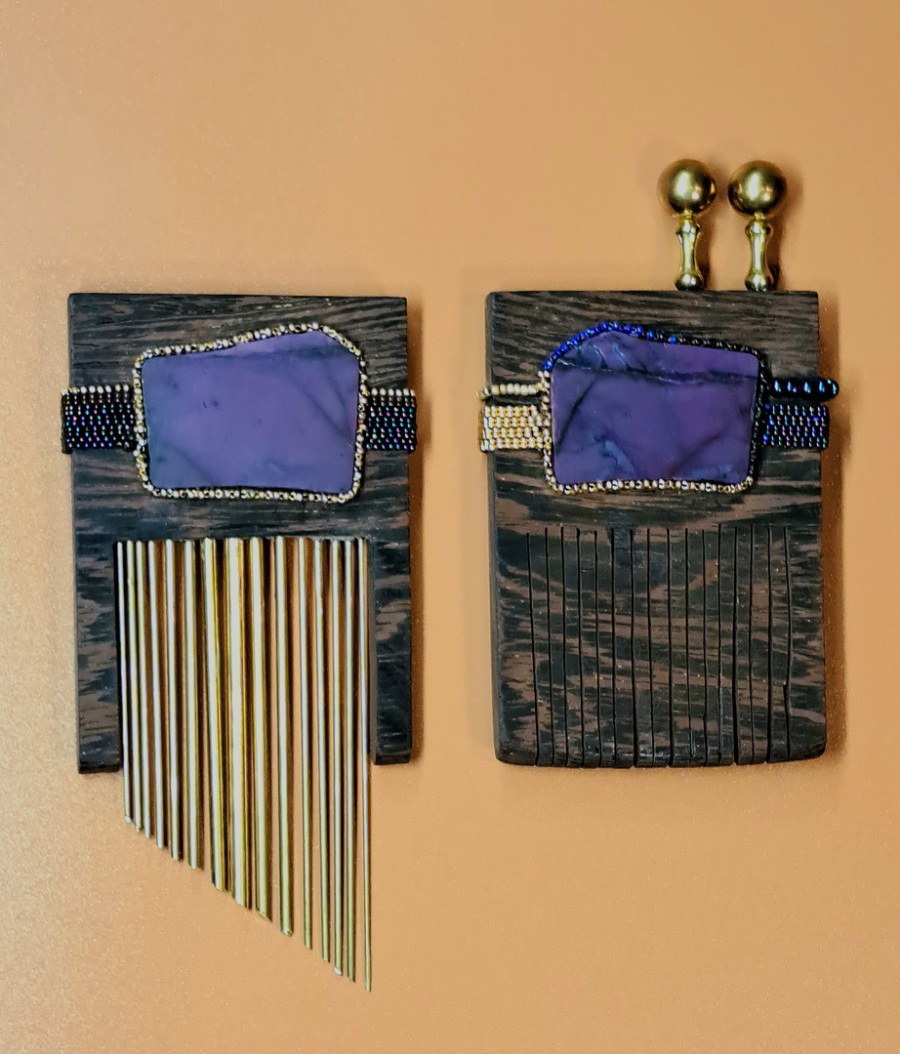
Reflectively matching sugilite slabs, make an unmatching match in this comb set.
Sugilite slabs with a woven seed bead cabachon setting, and then mounted on wenge wood- Both combs with brass accent.
This was an interesting series ('Quiet Combs') as I wanted the beads to enhance the lovely darker wood grain, and merge with it, in a holistic sort of way.
The hair sticks had more of an organic, free flowing weave in the work, while the combs had something more rigid, repeating, and uniform.
I also thought it would be cool to match the combs in an 'unmatched' way- making them COMPLETE, not necessarily PERFECT. I really enjoyed this approach because completion leaves all sorts of room for variables, including flaw....whereas perfection has none.
I noticed when cutting the stones, that while they were same in shape, they weren't in design. They were RELATED in design, being side by side pieces, yet not the same. I was really impressed with that idea; the thought of a rock being 'whole', and yet different in pattern throughout its structure...no one 'part' ever quite like another-perfection irrelivant, completion as fact.
I was satisfied with how these translated from idea to manifestation. I wasn't sure, about halfway though creating, about where I wanted to go in terms of final product- and then someone suggested bright colors like turquoise and coral, yet felt that might work AGAINST the sugilite, not enhance it.
Plus, I wanted to keep these combs more earthy in color since I had already veered off of a 'quiet comb' concept with a the long combs in this series..I felt it was enough exploration of bright beads against the wenge wood (which included both turquoise and coral in combination with the long combs attempt).
I liked the idea of the brass teeth being both various in size, as well as length.. It gives an odd, yet fair balance to the brass antenna on the partner comb.
The wood teeth on the one was something I wasn't certain about at first; I did very little to it in terms of sanding and shaping. Not only were the wenge teeth incredibly fragile to handle, but I wanted keep an opposing style in look of the highly uniform and polished brass teeth.
The wonkiness of the wood teeth, the imperfection of its off balance- its NON balance just reinforced the brass that much more so, and resulted with me deciding to leave the wood teeth pretty rough, and untouched as final.
The balance between wood and metal works well as a set-..More balanced together than apart-
A happy duo to behold.
Light Curtain 9.23
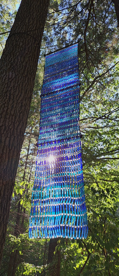
A long glass curtain displays a cascade of blues, in a woodland setting.
This is a first attempt at a larger glass textile for outdoor expression; Strung on plastic-coated, spun steel thread ('tiger tail'), and utilized in a right-angle weave- using spray painted glass beads, and metal crimper beads for knotting.
I wasn't sure how I wanted this to be made exactly.. I knew I wanted SOME of the weave to be incredibly formatted, and evenly spaced...yet I ALSO wanted to see the work 'loosy-goosy', and sort of free-flowing.
My resolve was to mimic the concept of blowing curtains one might see during a hot summer day; when a gust of wind comes in...Not really rustling the WHOLE yard, but just that lower edging that gets picked up in a light breezy fray.
I really like the colors I chose for this design, and I like how there are slight color changes in this- making it look more blue at times, yet at other times, more purple. I hope to explore more on this next year, perhaps with a focus on specific beads that hold more of those color changing properties (that could really ADD, to this sort of design).
All-in-all I think it was a worthwhile endeavor, and hope to create larger panels in the future. A gazebo type structure could be lovely, and is an ideal size in my minds eye.
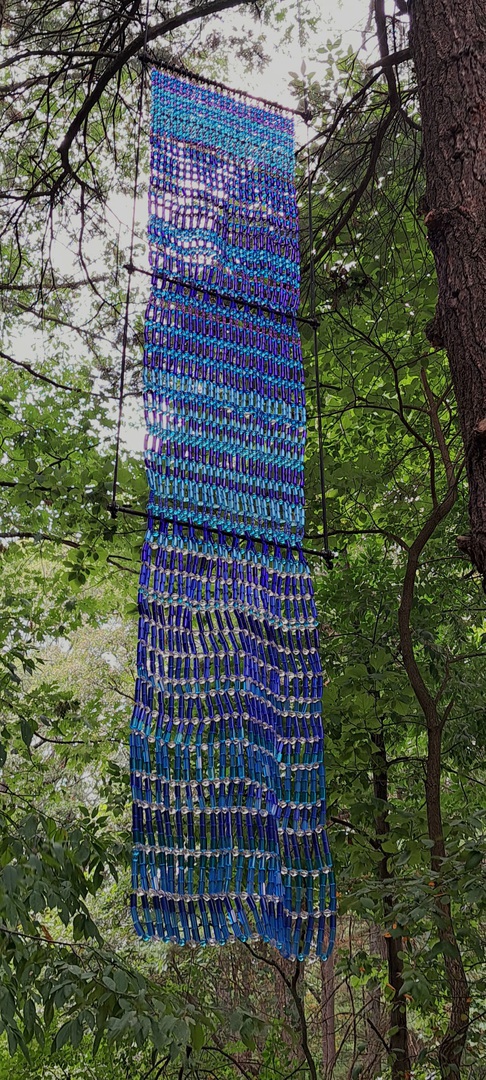
(Below we can see the same installment hung with wider support beams..While I do think that this is a cool idea for a future project, I felt it detracted from the actual lines being made from the weave in this concept, and visually weakens both object and support frame mutually. Thank you J, for helping me assemble and math!)
Silver Cuff 8.23
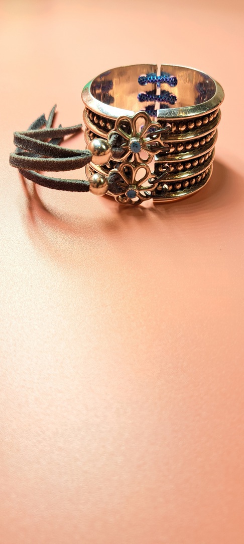
A hinged sterling clamshell style cuff gets a remodel...and I'm so glad I tried this idea out! While I love the dramatic statement this cuff makes, it simply did not function. A hinged clasp has to be incredibly tight in its hinge in order to make wearable, without falling off.
...and even THEN, with basic movement such as dance or bicycling, the cuff can open slightly, grabbing skin- leaving bruises...I love fashion, but not at THAT price.
While I could have kept it as a wrist cuff, I enjoyed the thought of a heavy silver band around the leg- and it is not something I have explored ( as of yet). I hope to delve in to these a bit further..and I am betting there are many clamshells at discount , for the exact reasons I mention.
I had originally made beaded rings on all sides, but felt it looked messy- detracting the eye from both silver pattern detail AND the beadwork.
As an alternative, I decided to use galvanized steel rings which matched the silver detailing ( when unpolished) in a very unnoticable way.
Converting to an anklet meant a need for a slight bit more room. While I could have beaded that extention ( and probably will on future conversions), I chose, instead on sterling sandcast blossoms that had turquiose cabachon centers.
This added a texture to the sterling design without the messiness of glass on metal overkill, that beads can sometimes portray.
Two sterling beads were reamed to make a taut fit on suede cording. In the future, I may want to explore beaded cords instead, but for a first attempt idea, I was thoroughly satisfied with what was produced.